I use Omnifocus everyday to track what I'm doing, and I love it, but there are tons of UI problems with it that drive me absolutely crazy. There's a good article about some of the failings of the interface design here (with a video showing some of them), but there's one interface decision that's been absolutely driving me nuts lately.
Look at this picture:
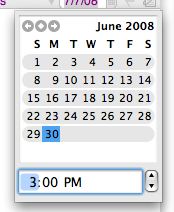
See anything wrong with it?
If you said, "There's no way to set the due date for a project to Tuesday without clicking the little arrow at the top left to go to next month" then you're right.
What a horrible failure of UI design. I end up up dealing with this at the end of every month, and everytime it's a pain in the ass. Compare it to the iCal day chooser:
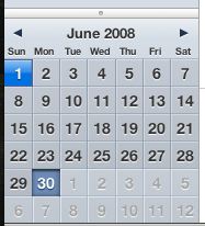
See that? Much better. They just grey out the days in the upcoming month. (They even go above and beyond the call of duty and show two upcoming weeks.) This is what the Omnifocus date chooser should be.
Hopefully there will be an Omnifocus update soon that addresses most of the problems with the interface. I expect more at the price point ($89) that they've positioned it at.